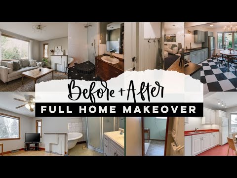
Sharing a full home makeover of this 1945 post war era house into a charming AirBnB. Check out the full modern classic before and after!
There’s something about seeing a whole home totally transformed that is incredibly satisfying. We’ve worked our way through two houses now including this one (here’s the first, and we are still working on our own home we’re living in!). But to shut the door and say, it’s done! Just feels so dang good. If you are just popping in from Pinterest (hello! welcome!), we purchased this house in May of this year to make over into an AirBnB in Calgary, Alberta.
We worked on it for two months and have been renting it since. It’s taken me a while to get it all up on the blog, so it really does feel good to share this now and check this off that running list of projects in my mind. It’s a 1945 post war era home, so very simple but with classic features like original wood floors, wood trim and doors with pretty door knobs and a clawfoot tub. Honestly, other than that, the house had been updated so there wasn’t a lot worth preserving in the kitchen, bathroom, and basement suite.
I’ve shared individual room makeover blog posts for each of the spaces. If you’d like more details on a space, I’ll link that for you so you can click over and check it out!
If you want to go all the way back and see this from the beginning, you can see the before post with our plans here, and if you’re interested in how we planned it all- check this out. If you’re just looking for shopping links- I got you. You can shop this classic home right here.
If you’d like to look into booking the house for your visit to Calgary, Alberta, you can do that right here on Airbnb! You can also book the basement suite on AirBnB here!
Exterior + Backyard
There wasn’t too much work done on the exterior. We did have to replace the picture window glass and took some time to clean up and paint the window trim and casing. We also refinished the beautiful front door. We painted the black railing and mailbox that was rusting as well. It’s a small change but it definitely cleans it up!
Eventually, we’d love to paint the stucco of the house maybe a beautiful green. But for now, it’s totally classic and ready for rental!
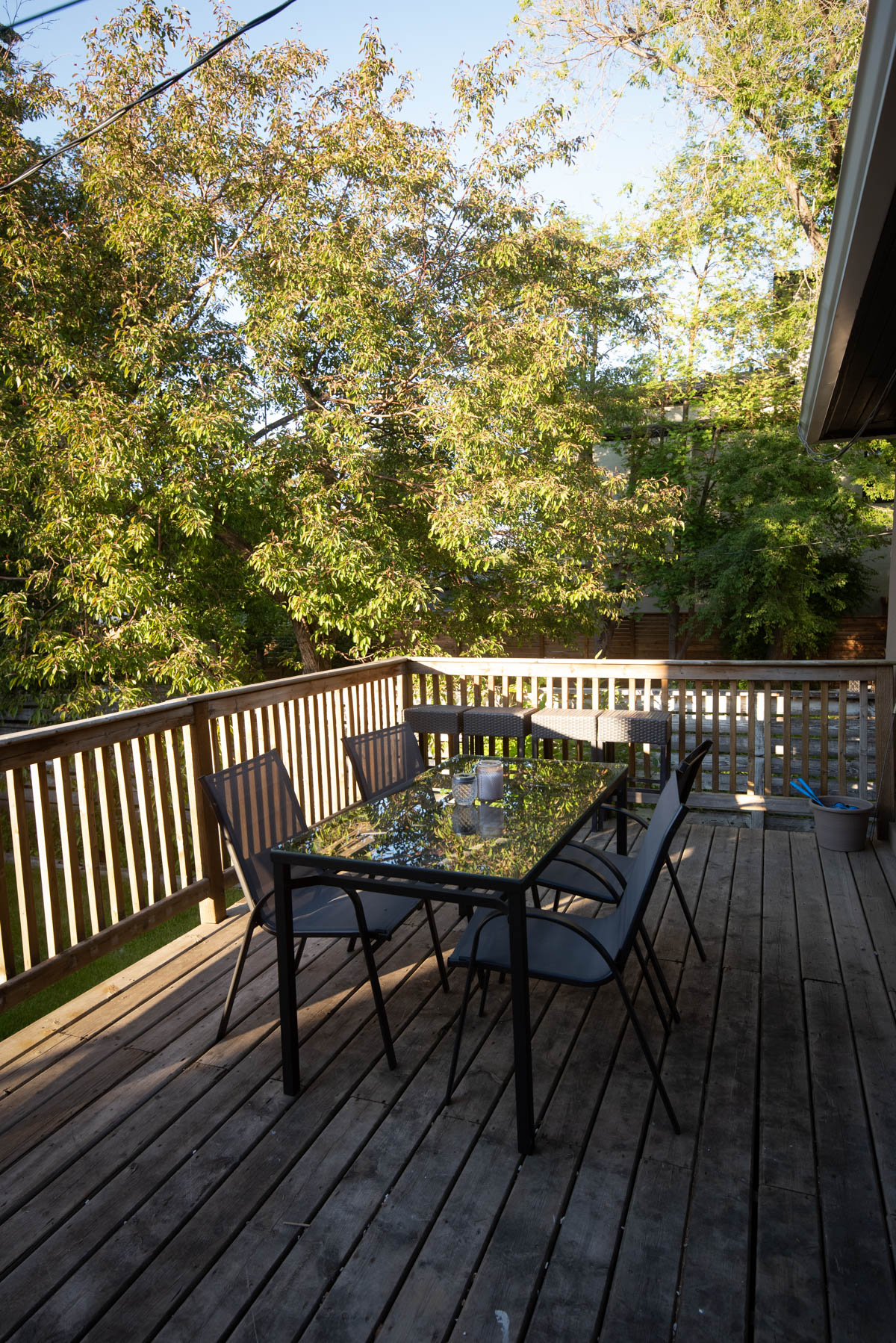
The backyard and deck area took some clean up and repair. The deck was unsafe so we spent some time replacing boards and railing pieces, but now it’s totally functional and we enjoyed most of our dinners during our visits out here. I love that Calgary has fire pits in almost every backyard in the inner city. It’s against the bylaw where we live in BC so it felt like such a treat. We chose some cheerful blue adirondack chairs for around the fire. Up on the deck, we repurposed a table we found in the garage of the house with some spray paint and some sling back chairs.
Since the front door is original and so darn pretty, we didn’t want to mess with that at all for a smart lock for the AirBnB. We made the back door the main entrance to the house. The entrance to the suite is around the side of the house.
The Basement Suite
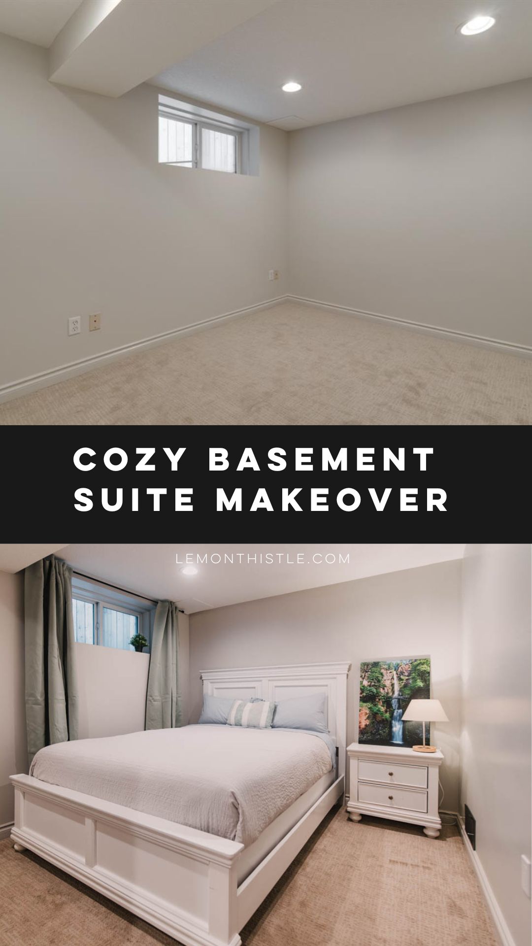
One of the selling features of this house is that it had a legal two bedroom basement suite for us to work with. We had originally planned to make this a long term rental but switched gears and furnished it for an AirBnB as well as we started to collect furniture and supplies.
The entry stairway was so drab with peeling linoleum, rubber stair treads that were falling off and dated light fixtures. We replaced the flooring with wood-look vinyl planks and added some fresh trim. The light fixtures aren’t anything fancy, but they sure make a difference in how this space feels. We also added a door into the bathroom down here (it only had access from the back bedroom before! How strange!) which meant a bit of drywall patching. Since we were on such a tight timeline, we opted to beadboard to save the mudding and taping and dry time. This sent us in a bit of a modern farmhouse direction that I think added so much personality to the space- it didn’t have much before!
This green is called Dusty Olive from Behr and it’s just lovely. The hooks are convenient to hang bags and jackets as guests come in.
The kitchen in here needed to be gutted. It wasn’t at all functional (the oven couldn’t open more than 6″ before it hit the fridge!). We opted for IKEA cabinets and a one wall design which opened up room for an eat in kitchen. I love the green beadboard in here as well with the black hardware and countertops. The green warms up what would have been such a meh black white and tan space.
The living room made use of furniture we already had- see these couches in our old home here! We mounted a shelf to the wall for the TV instead of using a piece of furniture to help the cozy room feel more spacious. All the art is from my dad’s collection- he’s an incredible landscape photographer and the deep greens play so well with the colour we painted in the kitchen.
The front bedroom we went with a softer version of the green palette with those pretty sage velvet curtains. I love the look of floor length curtains to cozy up a room. All of the furniture was from Facebook Marketplace and the art was from my dad.
Into the back bedroom, again I went with floor length curtains, this time in a deeper olive colour- I want to order these for my house now! This room is a double bedroom so we made the second half of it a bunk room making it awesome for big families (like us!). Our kids decorated the bunk room with art they made and we left a small table with art supplies so other kids could create while they stay as well. I didn’t have a great before/after angle of this, but you can see the whole reveal and photos of this bedroom here.
The bathroom didn’t see as much work as the rest of the suite. We painted, added the door and replaced the vanity counter/sink/mirror/light. We may or may not have an aversion to moulded plastic sinks after ours flooded a couple years ago. Did you know that they have no overflows?! I love that same colour of green in here- it plays so well with the tan flooring.
Main Floor Classic Entry + Living Room
Alright, on to the main floor! I love the arches into the living room and the detail on the ceiling. We went with a greige to help the detail on the ceiling stand out. It’s so cozy but still bright and neutral. In the entry, we added a small bench to drop bags on. We have since added some hooks but I took photos before those went up!
The star in here is really the Article sofa we found for a steal. We layered lots of wood tones and textures like that jute rug, floor length linen look curtains and fur throws… and it made for such an inviting space. The star light is maybe my favourite fixture in the main floor. But don’t tell the others ;)
The fireplace is on our ‘one day’ project list. I’d love to give it a cleaner profile and an electric insert for guests to use. We decorated the mantle simply with a couple pretty prints and some dried florals.
Dark and Moody Bedrooms
I’m a sucker for a dark and moody bedroom. I think the perfect recipe for a cozy and relaxing bedroom is dark walls, white bedding and curtains and some plants. Add a wall treatment on the headboard wall if possible and you’re going to love your space. Every time.
In the king bedroom we chose to do just that. I went with a taupe for the walls- never did I ever think I’d choose a brown for walls after chocolate brown had it’s moment in the early 2000’s… but it was calling my name!
In the front bedroom I chose the most beautiful green that plays with the wood doors and trim SO DANG WELL. I love this colour more than I expected to. And I always love green. The prints in here add a bit of fun to the space and of course, more floor length curtains, plants and dried florals ;)
Modern Classic Bathroom
This bathroom was just a dream to makeover with that claw foot tub. We chose some classic tile and gave it a modern twist by making the main tile black instead of white. The white walls keep it nice and bright and the open shower feel modern and spa like. I love all the brass finishes in here- it makes it feel just a touch fancier than it would otherwise.
The muddy green paint and wood vanity (from an old dresser!) help warm up the black and white tile. I love how this feels classic and cozy but modern all at the same time. I can’t wait to get back here and make some big ol’ DIY art for above the toilet/bathtub!
Checkerboard Kitchen
Next we head down the hallway towards the kitchen! This checkerboard floor is the floor I dreamed of for this space, but on a budget! It’s VCT tile and so darn pretty. We closed off the stairs to the basement (the door on the left) and built in a laundry closet to totally separate the lower and main floor suites. The doors on these closets were replaced and not original. We wanted them to match a bit better so replaced those with a heritage line of door and painted them blue to match the kitchen. Some affordable glass door knobs and a fun flush mount star light and this hallway is no longer boring but a total feature as well!
The kitchen was renovated in the 80’s we’re assuming. There was no beautiful original details to speak of so we wanted to add some character back into the space. The kitchen cabinets totally functioned so we opted to paint them out instead of replace them. I love how much painting cabinets can transform a space! We took out some of the uppers to help it feel more open and added brass hardware and fixtures in here as well.
Since there’s no dining room in this home, the eat in kitchen had to work hard. I love this wood table that will wear well with use (we refinished it after finding it in the rafters of the garage!) and the chandelier is so simple and airy but definitely a statement. Also… more dried florals, because I think they’re so beautiful and they require no upkeep!
We removed some of the upper cabinets to open things up and keep the beam from making the kitchen feel cramped. I love an open shelf for storing practical but beautiful kitchen items. We also moved the stove in one cabinet to keep it from being on the end of the cabinet run for safety.
More of a watch > read type of friend? I got you:

Phew! So that’s the whole home! Again, you can click on each room header to see the full blog post on the space. If you’d like just shopping links, you can find those all right here as well.
Tux House is our rental property in Calgary, Alberta. Located in the inner city neighbourhood of Tuxedo, this 1940’s charmer has a main floor & basement suite that we’ve shared the transformation of here on Lemon Thistle!
You can shop this classic home right here.
MORE TUX HOUSE:
LIKE IT? PIN IT!


 Checkered & Blue Kitchen Reveal
Lovely! What a nice place. Your choices on the paint colors is perfect. What is the color of the dark green that you used. Also, the one that has the hooks on it. Thanks.
Thank you so much Dana, those are two of my fave colours in the house too! The upstairs bedroom green is called Forest Floor from Benjamin Moore. The green downstairs with the hooks is called Dusty Olive by Behr :)