This DIY modern farmhouse kitchen makeover is a budget remodel thanks to painted cabinets and countertops!

I’m so very excited to share this DIY modern farmhouse kitchen makeover reveal with you all! Since I shared part one of this makeover, full of tips on painting kitchen cabinets, I know so many of you have been waiting patiently for the reveal. The homeowners did so much of this DIY makeover themselves and it’s officially finished and they’re moving in! I’m blown away yet again with how incredible paint is. This transformation is so so good.

Let’s start with some backstory then we’ll get into the details! This kitchen in an actual farmhouse (Honestly- I only know two farmers but it just happens I’ve worked on room makeovers for both of them, ha!) and has been in the family since it was built in the 90s. My friends were moving in and wanted to give it fresh style to match their preference but without the expense of a brand new kitchen. Their aesthetic preference is modern farmhouse and dang, did they nail that! If you’ve been following Lemon Thistle for a while, you might have noticed that my style is more modern than farmhouse, but working in an actual farmhouse? I mean, you can’t not play with that!
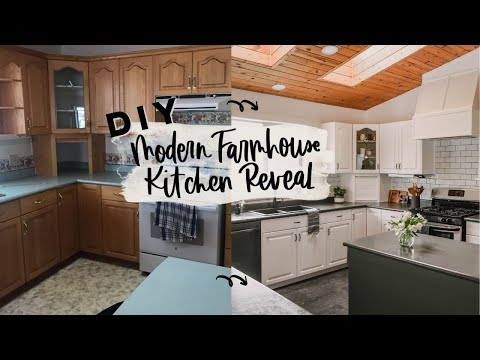
Let’s take a peek at the before of this kitchen.

When we first started chatting about the makeover, my friend just knew she wanted to paint the original oak cabinets white and remove a bank of cabinets for open shelving. It was so fun to watch the plans evolve as the kitchen came together! A pop of colour on the island! New tile backsplash and vinyl flooring! Custom hoodfan?! Heck yes! Ditch that crown moulding! New sink and faucet! Update the hardware! And the last decision? Resurface that countertop!
You can see the full post about painting the cabinets RIGHT HERE.
And here you can see the full video reveal if you prefer to watch over read! If you prefer photos and text, just keep on reading ;)

Incredible, right?! Like I said earlier, I helped paint the cabinets and consulted on the designs but the homeowners did pretty much everything themselves. If you’re wanting to DIY a kitchen refresh, let this be encouragement!
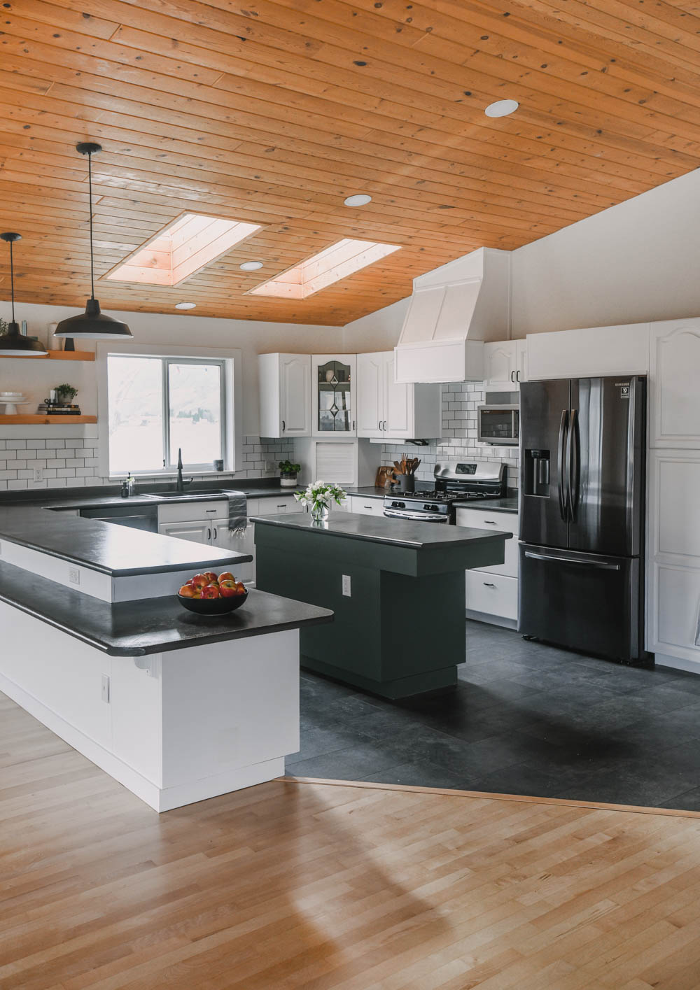
So the first decisions that were made (other than painting!) were to remove the cabinets to the left of the sink and the corner shelving to the right of the sink. The hood fan cabinet and the crown moulding were also removed as was the open corner shelving on the island. These elements were dated but also just didn’t work for the family that was moving in. The removed cabinets allowed for the window to be trimmed out with farmhouse trim and open shelving to go in to the left of the sink.

I’m such a fan of open shelving in kitchens. I put them in my own kitchen, in our last kitchen and even did a video about how to style open shelving in the kitchen. I love that they’re both functional and beautiful, they add visual interest to a space and they open up sight lines making a kitchen feel more spacious and bright.


As far as styling these shelves, the homeowners hadn’t moved in when I shot this video and the photos so I brought most things with me! To keep it simple, I used houseplants they had, some basic white dishes and clear glasses (always a great base for styling kitchen shelves!) and some books and decor pieces.
I worked in sections just like I suggest in my styling kitchen shelving post and made sure to bring some of the green from the island up onto the shelf with a candle. I know, I don’t usually like candles on open shelving but I really wanted this colour up there and it was perfect. If I were using these shelves in practice, I’d probably space things closer together to allow for a fourth section- but I didn’t have a reason to do that since I was just trying to fill it for photos!


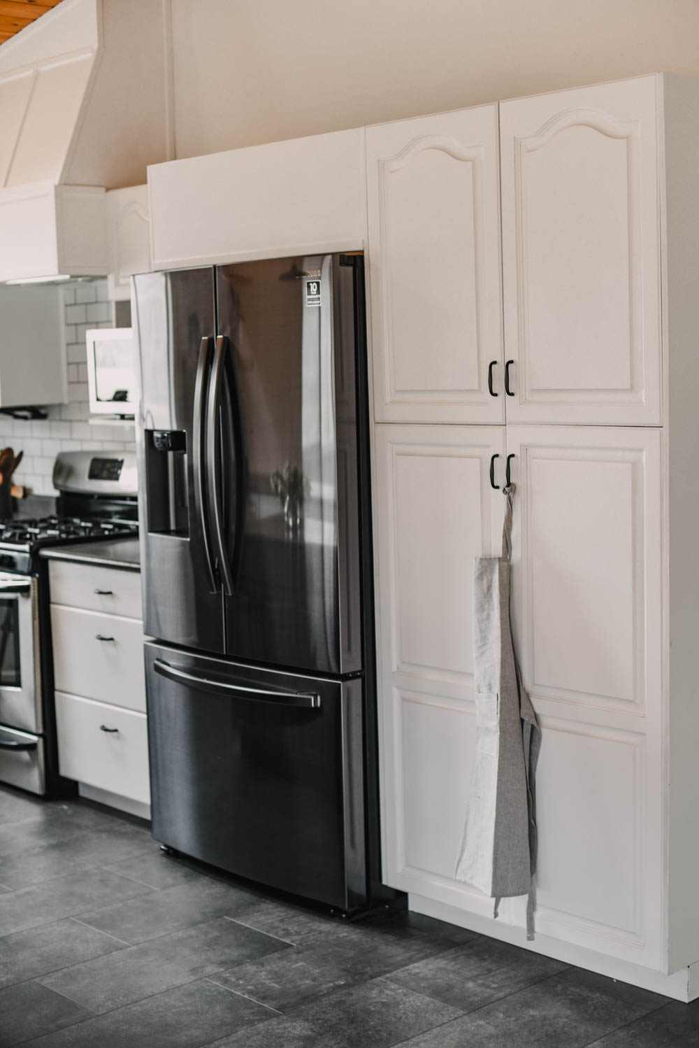
Other than removing the kitchen cabinets around the window, they also removed the cabinet above the stove with the hood fan. They built in a custom range hood that adds so much character and truly elevates the space. By removing the valance over the window and the crown moulding, this hood fan ties everything together and really showcases the vaulted ceiling. Over the fridge was cased in with a faux cabinet instead of installing new crown moulding. This ties the bank of cabinets together and gives a built in look.

Alright so the original oak cabinets were sanded lightly and painted out white then painted the island a beautiful green. The paint colours we used in here are ‘Pewter Green’ from Sherwin Williams and ‘Here Comes the Bride’ from BeautiTone. You can read all about painting cabinets in this first post.

When it comes to the green, we chatted about going navy or green. While she loved green, she was worried about the green reading to 90s cabin vibes… you know the one ;) Especially with the wood ceiling. Navy definitely seemed like the safer option, but I’m so glad she went for green in the end! A less saturated green with grey undertones modernizes the traditional colour and plays so well with the charcoal floors and the natural wood tones.
We didn’t patch any of the hardware holes so we were on the hunt for beautiful hardware that was the same 3″ center but in a black finish like the other new fixtures in the space.


I’m so excited to share that Schaub & Co partnered with us on this modern farmhouse kitchen makeover. These pulls we chose are solid brass with a durable matte black finish and are perfectly traditional with the modern black finish to bridge the classic oak cabinet design and the modern farmhouse style they love.
3″ Centre pulls are common for older cabinets but not used as often in modern designs. To find a beautiful pull with a modern black finish but the 3″ centre is such a score! You can find these right here on Schaub & Co’s website.


Let’s chat about the flooring! The kitchen previously had dated linoleum that was damaged. This gorgeous tile flooring is actually vinyl tile. You lay it and then grout between the tiles so you get the look of tile and the durability of vinyl. The variance in colour if the vinyl they chose is so beautiful too. It plays really well with the countertops.


Speaking of countertops… The original countertops are green laminate. While they had some damage, they were mostly just dated. New countertops weren’t in the books for this update, so we spent some time exploring DIY countertop resurfacing kits. They ended up ordering this one and it took two kits to finish the space. While they are just moving in so we don’t know how it will hold up, the reviews on this one are pretty good for durability! In the meantime… it definitely looks beautiful and is such an upgrade from the mint green laminate for this farmhouse kitchen!


One of the other major updates? This backsplash! Classic white subway tile with charcoal grout is the perfect backdrop for this modern farmhouse kitchen. This modern farmhouse kitchen has such great light coming in through all the windows in the open concept space and through the kitchen skylights. This tile bounces around the light even more.


Other things that they replaced in here include all the appliances, the sink (they chose a stone sink, so pretty!) and the faucet. They chose matte black finishes throughout including those pendant farmhouse lights and the faucet.
A couple notes about styling for this modern farmhouse kitchen? So many of the pieces I brought in are actually from Dollarama! I picked them up when shopping for my Dollar Store DIY Challenge. That tea towel, the apron, the small wood cutting boards? All Dollarama! Many of the other pieces were brought from my own green kitchen or plants they’d already moved in!
Alright, I’m going to leave it at that! I love getting involved in a good budget room makeover every now and then- it reminds me the power of paint and the return on sweat equity. It’s why we DIY!


sources:
- Traditional Solid Brass Matte Black Cabinet Pulls from Schaub & Co
- The paint colours we used in here are ‘Pewter Green’ from Sherwin Williams and ‘Here Comes the Bride’ from BeautiTone.
- You can read all about painting cabinets in this first post.
- Countertop resurfacing kit
Want to see more room transformations? See all my DIY Room Reveals right here!

 75+ Free Hand lettered Tech wallpaper for each month
Leave a Reply