Updating a basement suite with a boho farmhouse decor aesthetic on a budget! Sharing how we did it from the murals to the boho hanging chairs.

Last year we completely made over a 1945 post-war era home and transformed it from a tired rental into an AirBnB. We focused on bringing the upstairs rental back to it’s 1945 charm, but downstairs we just focused on getting totally functional. Part of that was updating the kitchen, some flooring and moving a door. We furnished it with what we could find and it totally worked… but it wasn’t very much fun.
You can see the original basement suite makeover here.

This spring, we decided it was time to give the space a refresh. We took the 8 hour drive and sold some of the furniture we had in the space to give us the budget for the refresh. It was a whirlwind makeover with some paint we had on hand, some new to us FB MarketPlace finds, hanging chairs, and some faux plants. I’m SO happy with how this space turned out. It’s totally fun to visit here now!
Tux House is our rental property in Calgary, Alberta. Located in the inner city neighbourhood of Tuxedo, this 1940’s charmer has a main floor & basement suite that we’ve shared the transformation of here on Lemon Thistle!
You can shop this classic home right here.

When we originally made over the suite, the kitchen and entry hallway were completely redone. We have beautiful new white cabinets with black hardware and bead board panelling. We had painted the bead board green (Dusty Olive by Behr) which played to the farmhouse vibe and we already had a hanging macrame planter in the kitchen.
This was the space in the house I loved, so we were going to run with that vibe but make it even more playful, we’re calling this decor style ‘boho farmhouse’.

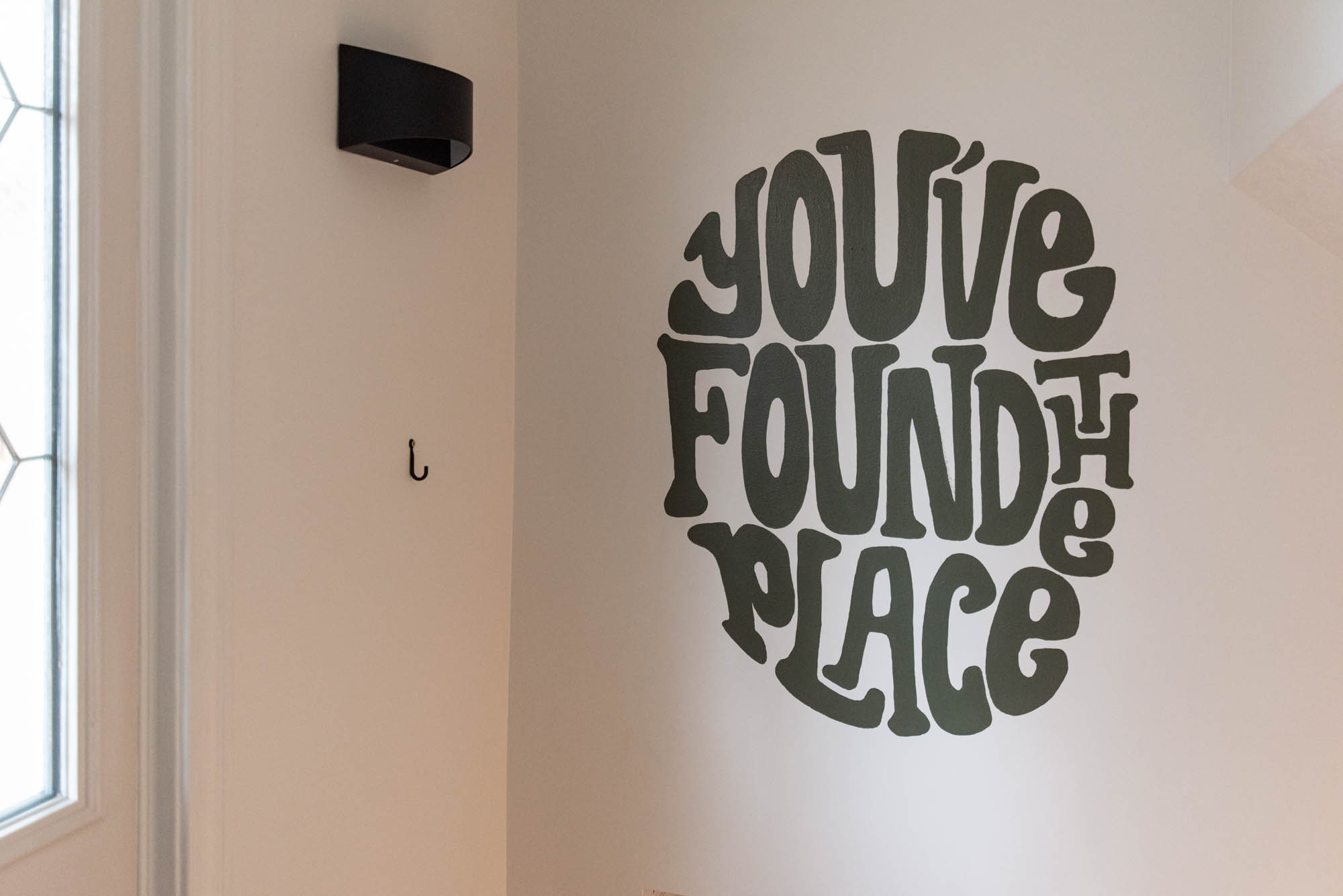
The first thing I did was paint a mural in the entryway and add a fun decal to the door. I labelled the door Tux Suite so there’s no confusion for guests and it’s really just so fun.
Inside that door, I painted a retro looking ‘you’ve found the place’ in a dark green paint (from this bedroom makeover).


This is a different style of hand lettering than my usual, but I wanted it to be so fun and unique to the space so challenged myself to try a more funky style of lettering. I had originally planned on adding a shadow to the lettering but between time and hand cramps, I kept it simple. I think it adds such a fun welcome to the suite!
I love a good mural, this past few years I’ve painted a few and I’ve been itching to do even more. Into the suite living room, we wanted to open things up and help the space feel more spacious.


*Affiliate links are used where possible in this post, at no cost to you. You can see more information and all our policies here!*
We opted to sell the more bulky (but truly beautiful) furniture that we had in there in favor of something more compact.
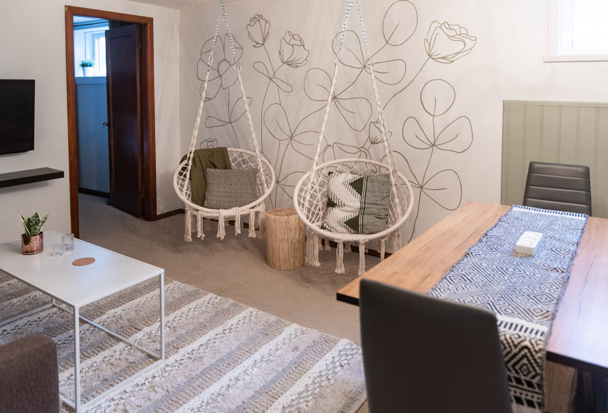
On the far wall, we opted for hanging chairs. We have these macrame chairs at our own home and we totally love them. We find them super comfortable to lounge in and I think they give such a playful vibe while making the space feel SO much bigger.
Since the chairs leave the wall mostly visible, I decided to take on a large line art mural. I was inspired by this simple one I found on pinterest and incorporated some of the eucalyptus leaves I love to illustrate from this line art panel I made a couple years back.
For this one, I used the same paint that we used in the basement suite farmhouse style kitchen on the wall panelling. I love that this really ties in the kitchen which is so important in an open concept space like this.


If you’re interested in painting a mural, check out this blog post on tips for beginners!
I really love the character this adds to the space, the color is totally farmhouse, but the line art florals going a little wild is kind of boho, especially paired with the macrame chairs!
We added a stump table between the chairs for guests to set coffees and books. We found a local maker who was selling these so we bought one more for our own home as well. After making our own in our bedroom, the $55 we paid was so worth it to skip the hours of work we know tracking down a stump, chipping bark and sanding takes.
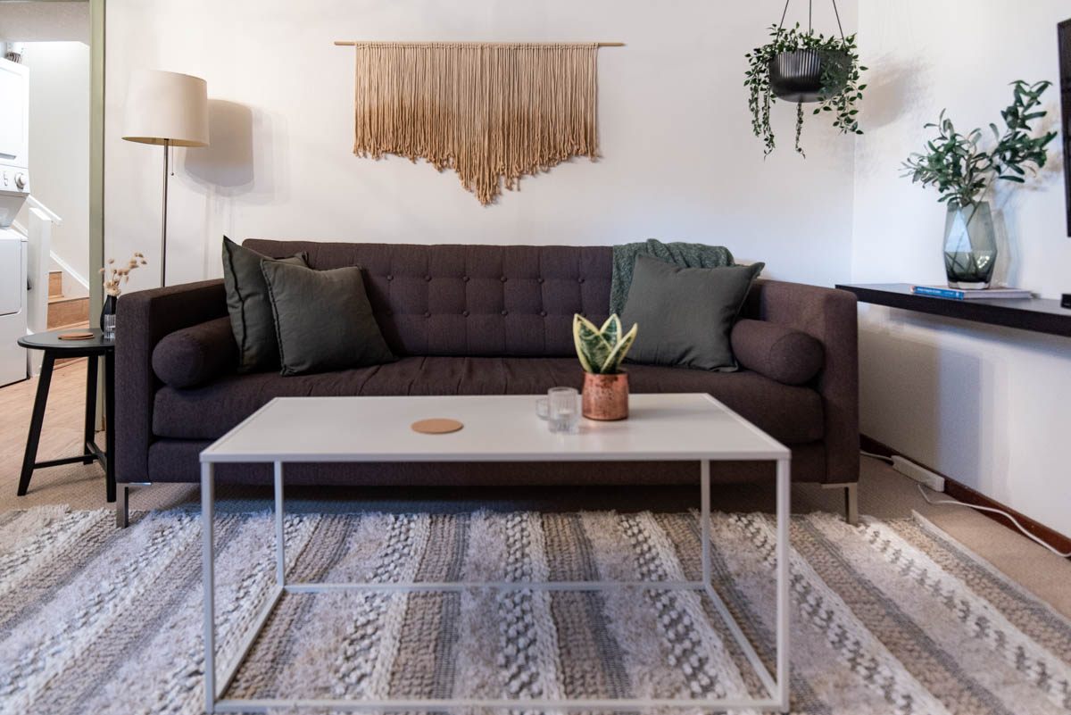
The rest of the living room, we kept the same layout but updated furnishings. We swapped the larger sofa for a more compact 3 seater sofa with a modern, structured shape. We swapped the bulkier end tables for a round one. We actually stole this one from upstairs since we added a desk to the living room up there it was no longer needed!


We also swapped the large ottoman for a simple metal coffee table and while the dark rug had anchored the room with all the light furniture and light walls, now that we had a dark sofa, we decided to swap the rug for something lighter and more textured as well.
While the mural was pretty much all the decor we needed… it wasn’t quite enough ;) I added a faux hanging plant in the corner beside the TV and DIYed a fiber hanging for over the sofa that’s perfectly boho. This one is so simple to make, I haven’t made a tutorial for it. But let me give you a quick run-down because I know you can make it yourself!
I used leftover macrame cord I’d cut for a workshop, but you can just cut pieces about the length of your wingspan for this. You just tie those on to a dowel (we got ours from Home Depot and didn’t cut it down, this is a long sofa so the 4′ dowel was perfect).
We tied them on using a larks head knot, which I’m sure you’ve done before without knowing what it’s called- it’s where you fold your cord in half, then loop the fold over your dowel, pulling the ends through the fold. I have a full Macrame for Beginners video that walks you through this knot if you’d like!


When I had attached them all, I cut them loosely to a point, keeping it organic and then dipped the ends in a bowl of coffee and tea for the color. I really love how this turned out! It’s such a simple DIY for such a big impact and totally matches the boho farmhouse aesthetic we were aiming for!
Other small changes we made in this living room? We swapped out the dried eucalyptus that had been… well, crushed, for some faux branches and added a lamp to help balance the hanging plant and add some layered lighting. This living room is the biggest transformation in the space- I’m so happy with it!

The other room we made major changes in is the bunk room. And by that I mean, we did away with the bunk beds. A lot went into that decision, but overall we’re super happy with the choice. We moved in our old futon (you can see it in our last home rec room), a tower for books and games, and a desk for working.
This makes the suite perfect for sleeping up to 5 (or 6 if two kiddos want to share the futon, that’s what our family did and it worked perfectly). The desk is so nice and spacious. We added a vase of pampas and a task lamp.


We moved one of the large canvases of my dad’s photography in here. I also took some time and printed off labels sharing where the photo was taken and what our family loves about that to make them feel more personalized.
If guests are using the desk for zoom meetings, the wall behind it is the zoom background. For that, we chose a picture ledge above the futon to display one of my dad’s photos we’d had in the suite already and a smaller canvas from my sister. Eventually, I’d love to add another mural here- but that’s a project for another day ;)


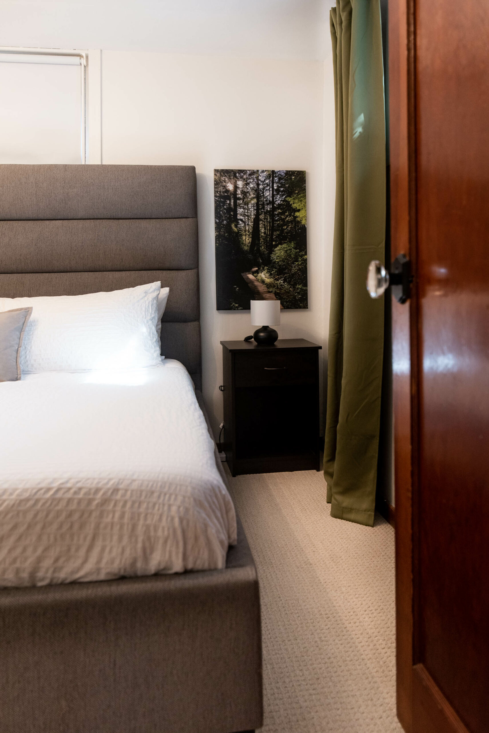
The other rooms we left pretty much as is but added a few decor pieces to help tie the new boho vibe in. In the king bedroom we also brought in a large map that’s identical to the one we keep in our own entryway.
I hand lettered ‘where do you call home?’ and cut that and some hearts out on my Cricut. We added hearts from our previous guests and left the stickers for guests to add when they visit. I really love how this looks and how fun it is as an interactive guest book of sorts.


In the bathroom and queen bedroom the updates were limited to art. We swapped out the art we had in there for pieces with a more boho farmhouse feel and I added a fun decal to the bathroom mirror as well.


These are relatively small changes but the space feels completely transformed. I really love what a few days of hard work and some creative buy and sell effort can accomplish.
So many of the early room makeovers on Lemon Thistle were totally budget focused, it felt great to really get scrappy with budget and create an amazing space using what we had access to.


We stayed in the new space for spring break and loved the coffee table for games (my kids are obsessed with chess right now), the hanging chairs for reading and the desk in the office for illustrating comic books. We put that small kitchen to work, cooking for our family of six and even though it’s small- it’s so well equipped. Our goal is to make a place that we love staying and we definitely accomplished that!
Tux House is our rental property in Calgary, Alberta. Located in the inner city neighbourhood of Tuxedo, this 1940’s charmer has a main floor & basement suite that we’ve shared the transformation of here on Lemon Thistle!
You can shop this classic home right here.
MORE TUX HOUSE:
LIKE IT? PIN IT!


 Free Printable Mothers Day Quotes
Leave a Reply