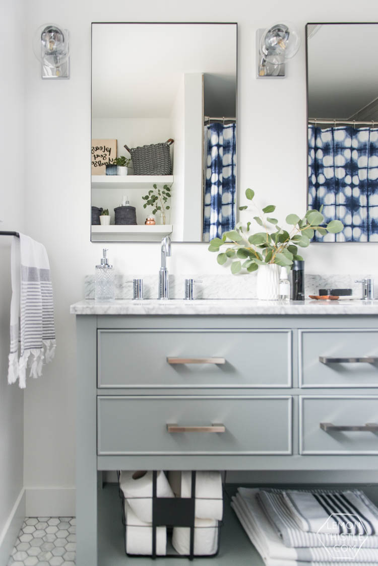
Today is THE day, you guys! I’m SO excited to share this modern bathroom makeover with you all. It’s been 7 weeks of hard work but has also been so worthwhile to have this space done! I’m completely in love with how it came together and while I KNEW the bones would be great with the vanity and flooring we chose, I’m even more excited about how the decor brought life to it. It’s classic to the bones with modern details and it’s safe to say I’m smitten with this space. And it’s a bathroom. So that’s borderline strange.
If you missed it, 6 weeks ago I announced that we’re joining in as a guest participant with the One Room Challenge. It’s a challenge to join with other bloggers and renovate a space in your home in *7* weeks, sharing updates each week. The space we took on is our one and only bathroom.
YOU CAN READ THE OTHER UPDATES SO FAR HERE:
WEEK 4 (DIY Tiling with Marble)
WEEK 5 (Open Storage Challenges)
Big thank you again to the sponsors for this project, Home Depot Canada and American Standard!
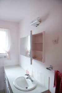
Should we start with a reminder of what the space looked like before before? This is what it was like when we bought our home. You can see all the before photos from our home right here. Aubrey spotted these photos and told me, ‘Wow! That lady has a really nice home. The toilet is pink!’… I love kids. I didn’t have the heart to tell her we painted all this pink white before she was old enough to remember!
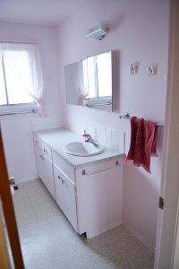
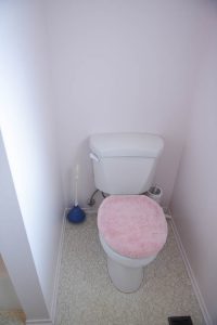
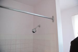
And NOW? It’s a whole new space! We did nothing to change the layout of the bathroom, so this is all just replacing fixtures and finishes. Here’s a recap of the work we did in here:
- Before the start of ORC:
- Replaced the tub & surround
- Replaced the window
- Replaced the door
- New trim
Which left it looking like this:
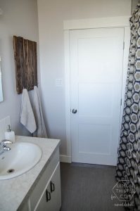
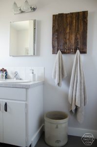
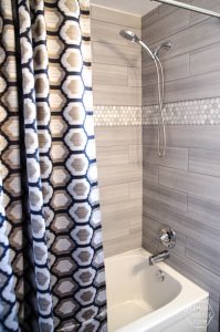
The shower/tub *had* to be done due to a really bad leak. We used leftover tile from our kitchen renovation which looked great but that longer shower tile is impossible to match and not wanting to touch a finished piece of the puzzle meant our makeover had to keep the footprint of the bathroom exactly the same. I talked all about that first stage of the renovation right here. Here’s what we took on in the last few weeks.
- ORC
- Tiled the floor
- Replaced the vanity, moving from one sink to two
- Replaced the toilet
- Added built in open shelving
- Removed medicine cabinet, re-drywalled
- Replaced the one light fixture with three
- Painted!
- New mirrors, towel bars, hooks etc
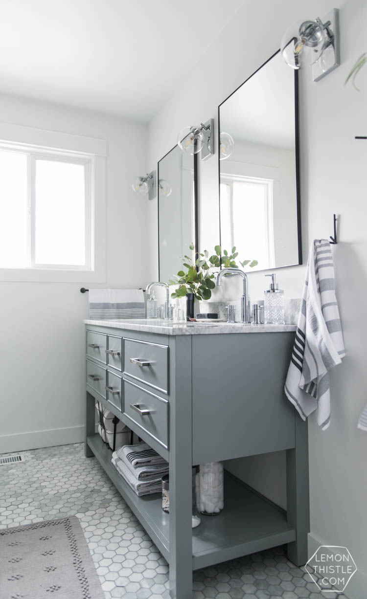
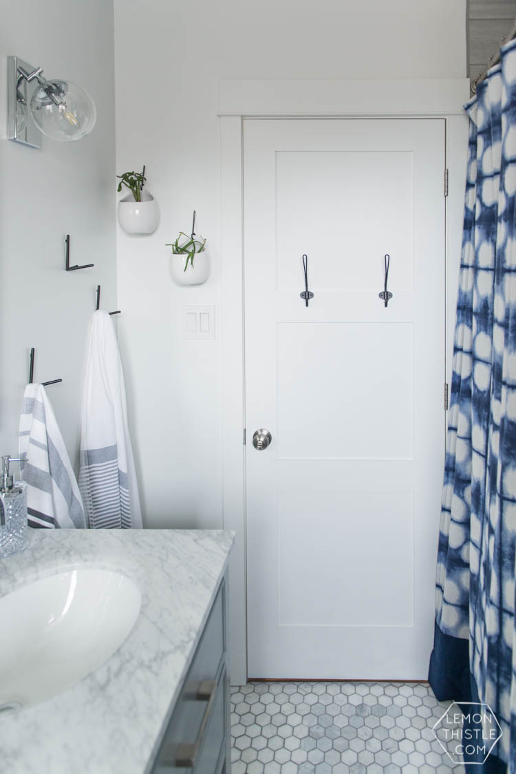
I honestly can’t pick my favourite part of the room! I would say the marble floor… because it’s amazing. But I’m also totally in love with the way the vanity wall turned out with those thin black framed mirrors and chrome globe lights and can we talk about the black contrast? I love it! And then there’s the pop of colour with the shower curtain… It’s totally my style you guys. And Shane agrees now that it’s all done that it’s totally NOT boring even without adding more colour or painting the walls a colour. The shibori shower curtain reflecting in the mirror adds tons of colour to the space and all the pieces- even the toilet paper holder add personality with the matte black finish.
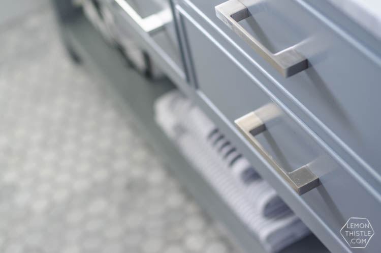
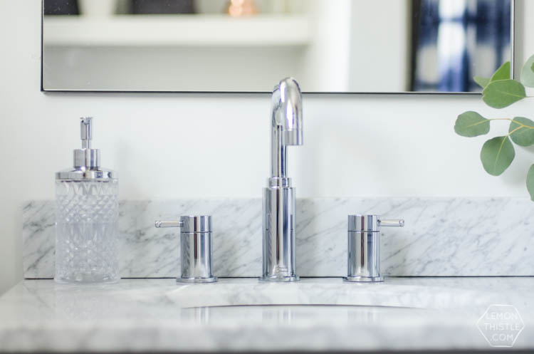
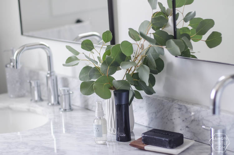
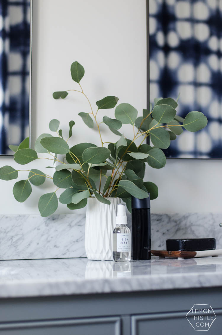
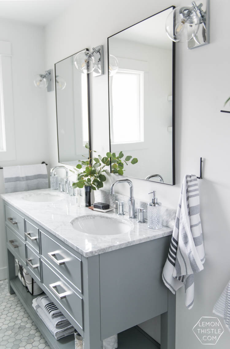
Let’s talk about the vanity wall for a hot minute… I’m totally in love with how it turned out! The vanity (Avanity Brooks Double Vanity from The Home Depot Canada) is so beautiful but it really is totally classic. The modern widespread Serin high arc chrome faucets from American Standard help add some modern – the traditional more decorative widespread faucets would have made it really hard to go modern with the rest of the space. Then those mirrors? I feel like those were one of the best finds. We snagged them from Homesense and that thin black metal frame was our jumping off point for all the other black details. And those details are now what make the room.
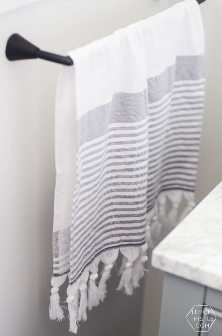
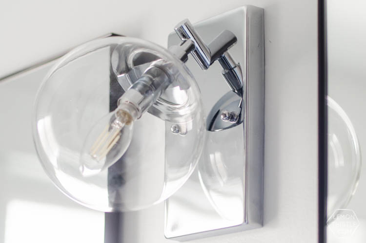
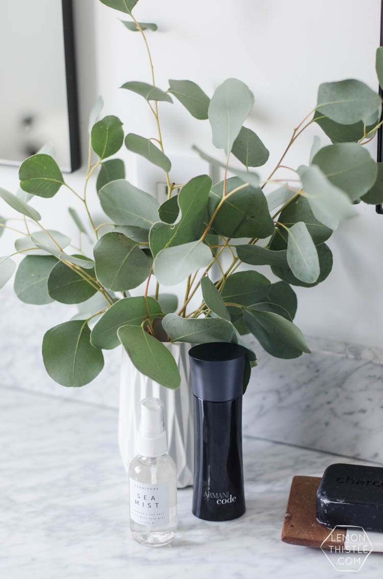
Shane was a bit skeptical of mixing the chrome fixtures with black- but it totally works. The sconces are from Progress Lighting Mod Collection online at The Home Depot Canada as well and the toughest part about them was finding lightbulbs we liked. Lightbulbs make the fixtures and it’s so tricky to get exactly the right ones- especially if you’re set on LED! The black framed mirrors pair so well with the modern double hooks, towel bar and toilet paper holder we ordered from CB2. I really love how those black hooks work almost as art over in the corner. Plus we can hang 6 towels and not just 1 like a towel bar in the same amount of space. The hooks on the back of the door have been there since we replaced the door and they’re just from Ikea but worked with the black so we left them.
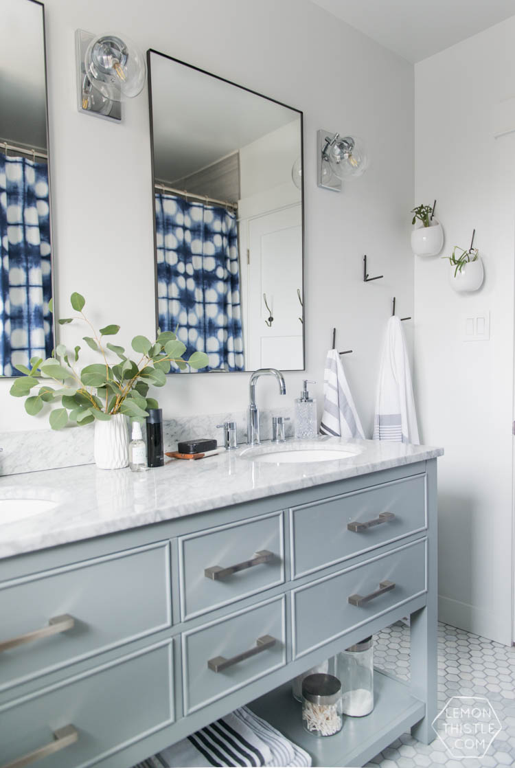

I’m still getting used to the open vanity and how our storage in here is changing. I’ve thrown out a LOT of things that we don’t use but there’s some bigger things that we used to keep in the bathroom vanity cabinets (like hot rollers) that I just don’t know what to do with now. Honestly- I never use the hot rollers but they’re one of those things I feel like if I get rid of I’ll want to use. Do you have stuff like that? I wish I could be a minimalist- it would be life changing, I’m sure. I’ve got three of those wire baskets (I can’t find them online, but bought them at Walmart) for under the vanity that I will probably swap out for the towels and pretty canisters down there just for function. They come with an off white cloth liner which would hide those things, but we’re trying to get used to having less in there before we pile it all back in.
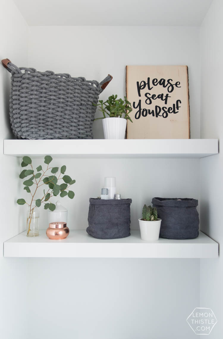
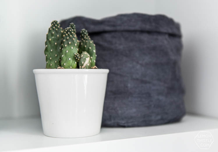
Would you believe my biggest struggle with the space was the open shelves? Well that AND photographing this tiny space without getting the 39 week pregnant belly in any of the photos with all the mirrors! We just installed the shelves last week and we actually had three of them made for the space (thank you Dad!) but they are SO much thicker than our previous DIY shelves that three shelves with enough room to actually put things on them ended up way close to the ceiling. And baskets to put on those shelves? I looked high and low, you guys! I even tried sewing myself some new ones but just couldn’t get it right. I ended up dying the ones that I’d already had (also DIY- find the tutorial here). I LOVE the way the dye took! I used black dye with a bit of navy dye (all Rit brand) and they came out this dark moody denim colour. It’s perfect with the texture of the drop cloth. With the shelves getting longer thanks to them being built in instead of on brackets the baskets looked so small arranged how I’d had them before. So I had to get creative with some rearranging… and plants!
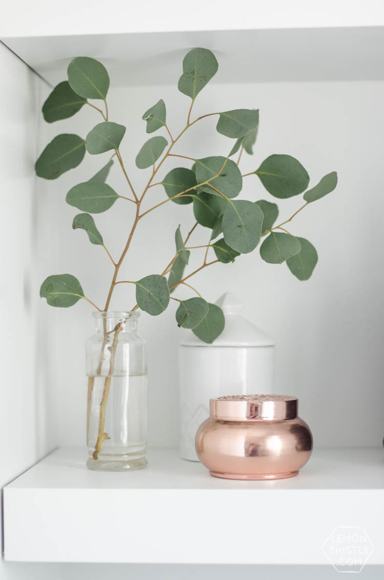
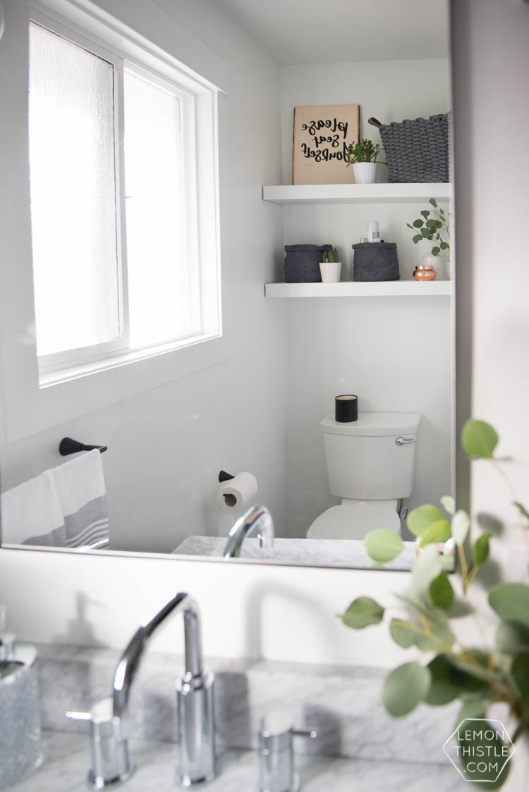
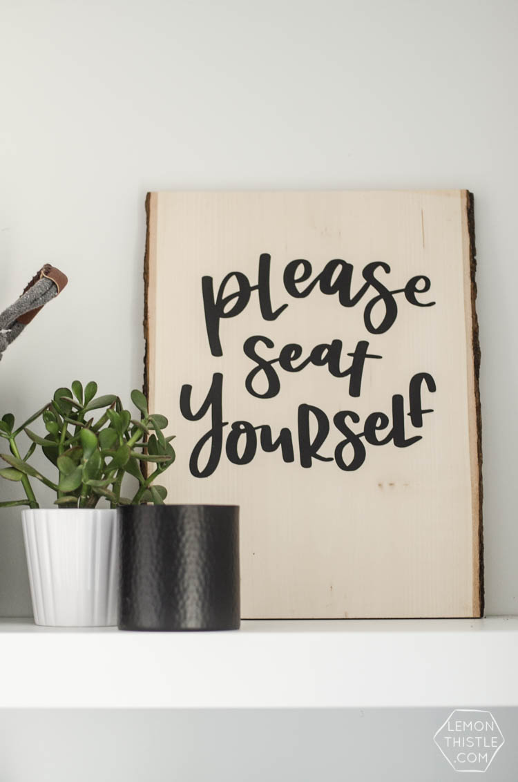
I also sprung for a new basket… Shane always rolls his eyes when I come home with something like a basket. Because we do have a lot. But now that we can’t lock our bathroom cleaners in the bottom cabinet of the vanity, I wanted to be able to have them up and out of the way and cleaners just aren’t pretty. This rope basket from Urban Barn hides them perfectly. AND it has leather detail on the handles. Score. To balance how tall it was, I made this sign- Shane picked the phrase. Would you like to see a DIY tutorial? It was so quick!
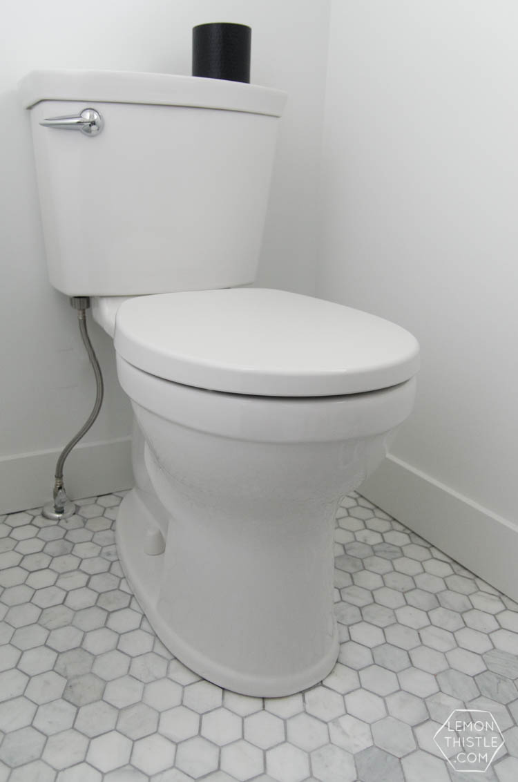

I’ve never really liked how the toilet is tucked away in it’s own little corner- it’s always felt dark and grungy, even after we painted and replaced that toilet seat cover when we moved in. But new flooring, paint, shelves AND a toilet? Now it doesn’t feel like that! I didn’t think I cared about a toilet until we started looking- We got the American Standard Champion 4 this time and I’m so impressed by it. We’ve always just bought the builder grade basic ones and called it a day. But the design details on this American Standard one (did I actually say that about a toilet?!) like the ridge on the tank lid and around the floor make it look SO much nicer in the space. And the chunkier shelves up there really do make such a difference.
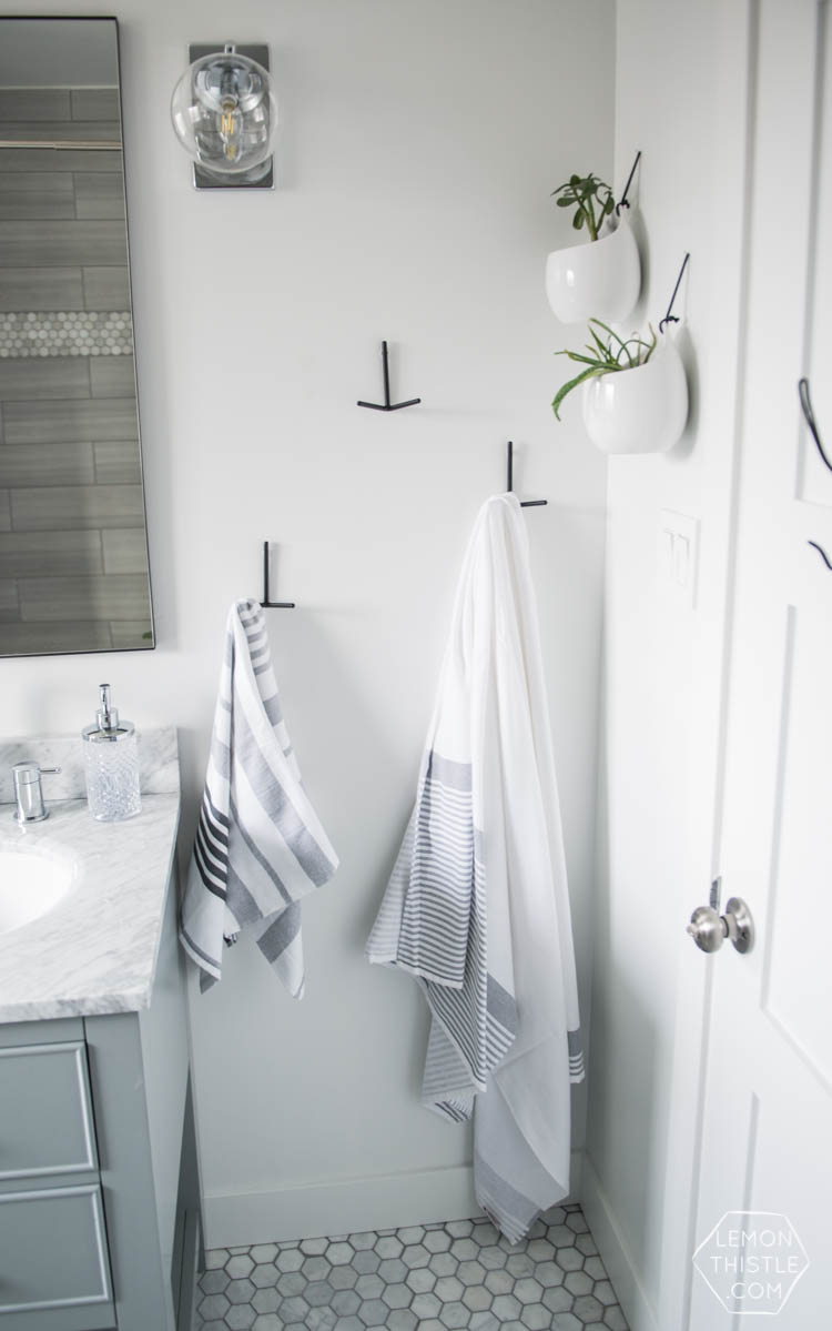

And that hanging planter I’d saved to hang in here? I didn’t take into account the lights being outside the edges of the vanity- so there wasn’t really any where for it to hang without hanging over something else. I’d also planned to make a sign or some kind of art for the right side of the vanity. We’d always had so much space over there before and the vanity actually got smaller… but by adding the lights- there’s less space on that end than before so I didn’t want to crowd things with art as well. I ended up picking up these two planters that hung off the wall instead to still get the plants into the space and really do like that they didn’t hang away from the wall for the sake of space. I actually have a ton of plants from my living room that are out of a home (did you catch that makeover on Monday!?) since we got a larger sectional that left no room for our bookshelf of plants. It’s nice that they’ll have a home and won’t die in our dark spare room (soon to be nursery!) anymore. So if they look sickly… that’s because I’ve totally neglected them in there.
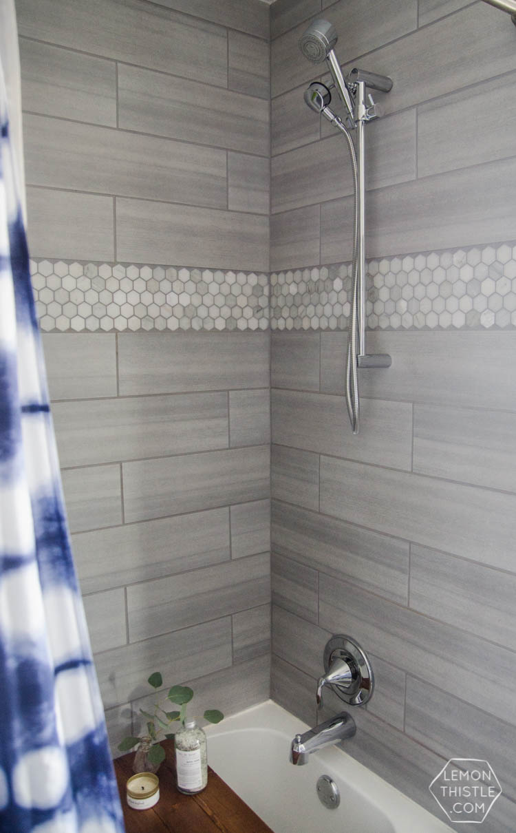
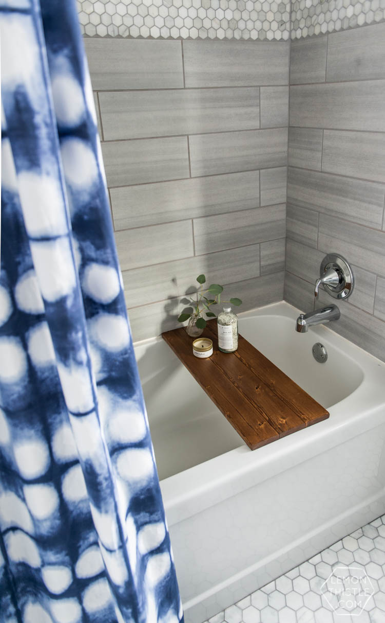
Last but not least… the shower! We swapped out the shower curtain and I’m completely in love with this shibori one! I had made the curtain previously and really did love the custom length BUT the fabric was upholstery weight and didn’t let the light through the same way. So you were showering without much natural light getting through (not a deal breaker) but this new one has all the white and lets light through so much nicer. We extended it to be the custom length by adding a navy panel on the bottom. To answer the question I get all the time YES we keep the curtain OUTSIDE the tub. We use a liner on the inside.
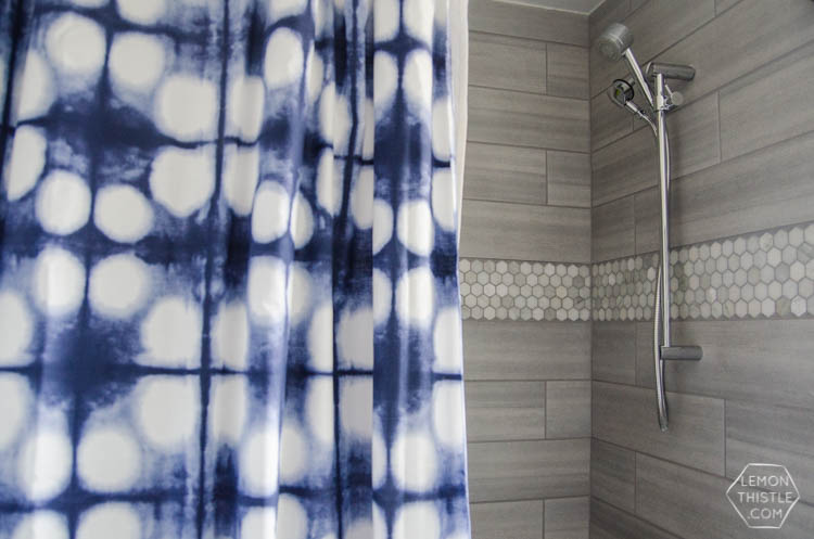
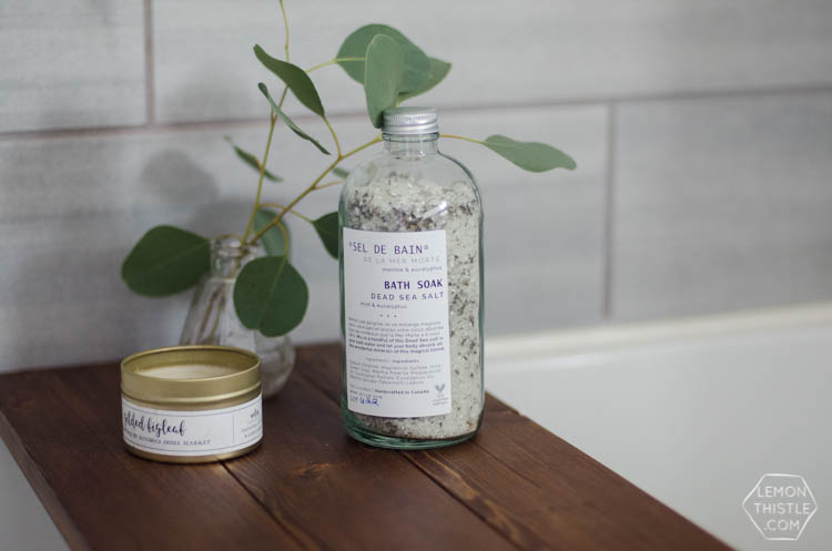
We also swapped out our shower fixture. The new one is American Standard Serin… from the same line as our faucets and adjusts heights so showering kiddos is 1000x easier. I love how modern that little shower head looks! It’s really tough to find a gorgeous modern shower head that is handheld and adjustable. It seems to be mutually exclusive usually! Thank you American Standard for solving my problems ;) I also gave my DIY bath caddy a refresh using walnut oil. I might write a post all about walnut oil because it’s honestly magic. I did some cutting boards at the same time. And that little wooden soap dish.
Alright… so this is the longest post already, so I’m going to leave it at that! I am totally in love with our space and it feels SO GOOD to have it done and off our plate before baby comes. It was definitely worth the crazy rush. I’m officially due on Friday so I’m going to sign off and pack a hospital bag ;)
If you love a good before and after…. don’t forget you can check out all the other One Room Challenge guest participant rooms over here!
SOURCES / SHOP THIS ROOM:
So one of the things I spend SO much time doing is answering emails and comments about where I’ve bought things SO I’m doing my best to link everything here for you guys to make it easier to find without waiting on my slow responses! If I’ve missed anything, let me know. It’s crazy that there is THIS MUCH stuff in a tiny bathroom. Imagine a full room! Ha!
- Vanity- Avanity Brooks Double Vanity from The Home Depot Canada
- Marble Hexagon Tile Flooring 2″ tiles- Sassi from The Home Depot Canada
- Marble Hexagon Tile in Shower (accent) 7/8″ tiles- Addison Place from The Home Depot Canada
- Main shower tile: This is ONLY available in Canada through special order at flooring stores now [San Marco-Viva-Linen]
- All grout is Delorian Gray (I talk about our experience with Fusion vs standard grout in this post)
- Faucets – American Standard Serin High Arc Widespread Faucets
- Mirrors, soap tray, towels, bath mat- Homesense Canada
- Shibori Shower Curtain (Extended with navy material- see this post for more options) – City Loft Nona from Bed Bath and Beyond
- Toilet- American Standard Champion 4 Round Bowl
- Chrome globe lights – Progress Lighting Mod Collection through The Home Depot Canada (online only)
- Shower fixture – American Standard Serin Complete Shower System in Polished Chrome
- Open shelving- Custom/DIY
- Shower Caddy- DIY tutorial here
- Black towel bar / Toilet paper holder / Modern double towel hooks on wall – CB2
- Towel hooks on back of door- Svartsjon Ikea
- Hanging planters – Vilhelm from Jysk
- Cloth baskets on shelf – DIY tutorial here
- Rope basket on shelf – Corde Basket from Urban Barn
- Soap pumps- Presidents Choice
- Wood sign- DIY… no tutorial yet, want to see one?!
- Metal basket (under vanity), copper candle holder – Walmart (not online)

 Our Holiday Living Room + Hello Holiday!
looks amazing! i love the chrome and the black. those black hooks really pop. and of course, all the tile work. enjoy!
b
Thank you so much! I’m so happy we went with the black and chrome mix :)
The whole bathroom is stunning! Beautiful job! I love the colours in here… I may have to copy it one day, lol. Cheers to finishing your first ORC!
Thanks so much Lindi! I feel like these are the same colours in your house :P
a beautiful bathroom and my favorite has got to be your vanity wall and I love you used simple eucalyptus branches throughout for that an effortlessly elegant touch. congrats on a fab #ORCFall2017!
Thanks so much Tim! I love having eucalyptus around the house!
Wow girl, what a transformation! That vanity is stunning!
Thanks so much Laurie! It’s so nice to have a vanity where the drawers actually open ;)
Colleen!! It’s all so beautiful. I can’t even choose my favorite thing. I love the sconces, the vanity, the vanity hardware…all the pretty bottles you found for styling…the towels! It’s a really dreamy space but looks so comfortable for a family. And the hand lettered sign for the toilet is hilarious! Great work on all of it. (And holy cow the before pictures…wha?! 180-degree transformation)!
Thank you SO much Laura! Your space turned out totally beautiful too! It’s amazing how the same tile can look so different depending on the finishes around it.
I love it all! Such a beautiful space. It’s making me want to rip our master bath apart! Nicely done, lady! Now, go relax and have that baby. :)
Thanks so much Alexis! You totally should… or at least I want to see what you’d do if you did ;)
Love everything!
What a beautiful change
Yes, i’d Love to know how to make the wood sign over the toilet.
Rita
Thanks so much Rita! I will put together a post on it- but in the meantime… it’s a pre-cut slice from Walnut Hollow and heat transfer vinyl cut with my Cricut :)
WOW! Love all the pretty touches you added to your bathroom especially the tiles! Congrats and Cheers to us for another room done!
Thank you so much Vel! It feels so great to have it done :)
I love how you have pulled this all together! An amazing reveal – you make tackling our master bath a possibility! Hopefully I’ll see you again in the Spring ORC?
Thanks so much Jen! You can totally do it! And maybe? Haha! We are hoping to list our home in the spring- so we’ll see where we’re at!
Love the reveal. It turned out stunning!
Thank you so much Debbie!
I love the way this turned out! Classic with a great deal of character. Those lights are perfection! Baby update??
Thanks so much Libbie! We actually had the babe the day this published!
It’s gorgeous! Now I need to know where you got your mirrors. Don’t say HomeSense. Lol!
Oh geez… of course they are! ;P